This website visualizes post processed data on wind and solar energy data, as well as on heating and cooling demand for space heating. This web-page documents the user interface, as well as assumptions and visualizations. Box plots are used often, and we start with describing these. Next the main menus are summarized, and differences between PVGIS and Renewables.ninja visualizations are explained.
content:
Box plots explained
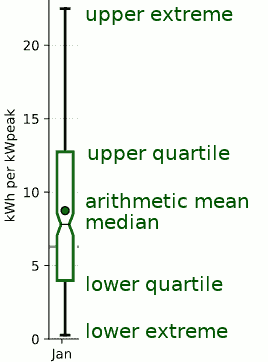
Figure 1. Box plot example
Box plots are credited to John W. Tuckey, which introduced this type of visual in 1969 to visualize the statistical properties of a data-set in a compact way. Figure 1 shows an example box plot, and the main properties can be summed up as:
| Upper extreme | Maximum value in the data set |
| Upper quartile | The level at which one quarter of the data set is higher, and the other three quarter lower, indicated as the top of the box |
| Arithmetic mean | The arithmetic mean of the data series, indicated with a dot |
| Median | The level at which half of the data set is higher, and the other half lower, indicated with a line and a notch in the box |
| Lower quartile | The level at which three quarter of the data set is higher, and the other quarter lower, indicated as the bottom of the box |
| Lower extreme | Minimum value in the data set |
So, in the shown example 25% of the values are lower than 4 kWh and 25% of the values are bigger than 13 kWh. Half of the values are between 4 and 13 kWh. Shown data is daily wind power in January for years 2005-2015, for Belgium using the Renewables.ninja 1.1 data set.
Continent maps
The continent maps allow to select a location with post processed data. For PVGIS, six regions are covered and the maps show city locations, while the Renewables.ninja covers Europe and shows countries covered in version 1.1 of the data set.
The top level buttons allow to choose between following options:
- Home page: navigate to home page.
- An optional Continent drop-down menu: in case more than one continent are covered
- Info: information about the used data-set, including references
- Manual: this user manual
- A text mentioning the used data-set
Location names are shown in the English language. Since these can differ from local language, a link to OpenStreetMap in local location is provided in the Post processed data menu structure.
Data stats menus
Following conventions are used in the data visualizations:
- Power is normalized to 1 kiloWatt peak capacity (1 kWpeak), unless noticed differently. This results in a peak energy production of 24 kiloWatt-hour (kWh) over one day
- Energy is expressed in kiloWatt-hour (kWh), with one kWh equivalent to 3.6 Mega-Joule
- Temperature is expressed in degrees Celsius
- Wind speed is expressed in degrees meter per second (m/s)
- Heating degree days (HDD) use 15.5 degrees Celsius as balance point, equivalent to 60 degrees Fahrenheit. This is the default convention at websites such as degreedays.net and wolframalpha.com. To obtain Heating degree days in Fahrenheit for a balance point of 60 degrees Fahrenheit, the shown values need to be multiplied with a factor 9/5 (or 1.8). As a rule of thumb, converting heating degree days in Celsius to energy in kWh for an average residential home in Belgium can be done by multiplying the HDD value with a factor 10. Alternatively, since one liter heating oil or one cubic meter of natural gas contain approximately 10 kWh of energy, the HDD value can serve as a proxy for the amount of consumed natural gas in cubic meter or heating oil in liter as a first order approximation (for balance point of 15.5 degrees Celsius and an average residential home in Belgium)
- Cooling degree days (CDD) use 21 degrees Celsius as balance point, equivalent to 70 degrees Fahrenheit. To convert shown degrees values to Fahrenheit, the multiplication factor of 9/5 needs to be used as well
- Each picture contains a summary of parameters used to configure the data-model
Location drop-down menu: showing the name of the selected location
- Home page: navigate to home page
- Continent name: navigate to continent name of the shown location
- Manual: this user manual
- OSM location: opens a new browser tab to OpenStreetMap. The selected location is highlighted, and shown in the local language
- Summary: a printable summary containing all visualizations in one web-page
Stats drop-down menu:
- summary: monthly averages for solar energy, heating and cooling degree days. Also, monthly averages for wind energy are shown for Renewables.ninja data.
- month: box plots of monthly solar and wind energy, as well as heating and cooling degree days, including a line representing the yearly arithmetic mean
- year: bar plots of yearly solar and wind energy, as well as heating and cooling degree days, including a line representing the arithmetic mean over the included years. For PVGIS discontinuities are sometimes seen in the yearly wind-data, especially near coasts. This is an artifact of the ERA-interim model, and indicates errors in the data-set
- weather: plots with yearly temperature and wind speed, and box plots of their monthly variation over the included years. Renewables.ninja data covers multiple sites, and therefore we use following visualization approach: no wind data is included, and for temperature a population weighted average is used
- An optional menu presenting a statistical wind model yield curve(PVGIS) or yearly offshore curve (Renewables.ninja). The PVGIS wind model visualization shows the normalized output curve in function of wind speed for following cases: (black) sea level at 15 degrees Celsius; (blue) Adjusted curve for average temperature and elevation of selected location. In the shown visualizations, the wind model adjusts air mass on an hourly basis using ambient temperature; (green) the equivalent behavior for wind speeds at 10 meter. This is a virtual curve. To obtain a wind speed at rotor height of 80 meter a factor of 1.3 is used. The Renewables.ninja offshore wind curve is only shown if the country possessed offshore wind power in 2016, and if so both onshore and offshore yearly wind energy is shown, as well as their average according to the installed capacity, also in 2016
Daily drop-down menu:
- daily solar: the left plot shows the average daily produced solar power per hour, for the local time zone. To visualize seasonal fluctuations twelve curves are included, one for each month. The right visualization presents a monthly box plot of daily solar energy production
- daily wind: the left plot shows the average daily produced wind power per hour, for the local time zone. To visualize seasonal fluctuations twelve curves are included, one for each month. The right visualization presents a monthly box plot of daily wind energy production
- daily HDD: the left plot shows the average heating degree value per individual hour, for the local time zone. To visualize seasonal fluctuations twelve curves are included, one for each month. The right visualization presents a monthly box plot of daily heating degree days
- daily CDD: the left plot shows the average cooling degree value per individual hour, for the local time zone. To visualize seasonal fluctuations twelve curves are included, one for each month. The right visualization presents a monthly box plot of daily cooling degree day
- daily offshore: an optional box plot if an offshore wind model is available (for Renewables.ninja data-model)
Loads drop-down menu:
since wind and solar have a different availability, this set of plots combines both energy sources for different demand scenarios. Five cases are shown, starting from 100% solar, incrementing wind in steps of 25% till 100% wind, for a constant peak power. First the mix of solar and wind is shown for a normalized combined peak power of 1 kWpeak; and next a power 10 kWpeak is assumed for the four load scenarios. 10 kWpeak corresponds to a peak capacity 240 kWh per day. Since load is not perfectly matched with generated power, both an energy surplus or deficit are possible.- solar&wind: monthly plot of daily power generation for different combinations of solar and wind power, normalized to 1kWatt peak.
- constant load: load of 10 kWh per day for different wind/solar combinations, with peak power of 10 kWpeak. This corresponds to a yearly power consumption of 3650 kWh, close to the average electricity consumption of a residential home in Belgium. This scenario should result in a big energy surplus, since only a capacity of about 5% should be achieved
- heating load: following a similar methodology, we assume 10 kWh of energy is needed per heating degree day as heat load, as a first order approximation of heat load of an average residential home. For convenience we do not worry about how a heating system on fossil fuels is converted to one using electricity from wind and solar instead. A cheap and fast solution is to use cheap electric space heaters; unfortunately this is not an effective approach
- low heating load: improving insulation, and using heat pumps allow more efficient heating. For the low energy heating load simulation we therefore replace the value of 10 kWh by 2.5 kWh per heating degree day, resulting in a heating load that is four times lower. While the surplus increases, we observe that for higher elevations there are still high deficits for solar power in the low heating scenario
- cooling load: for the cooling load we assume that 10 kWh per cooling degree day is needed for residential cooling. The other aspects are similar as in the other load scenarios
![energy [a] at-site.be](https://energy.at-site.be/email.png)